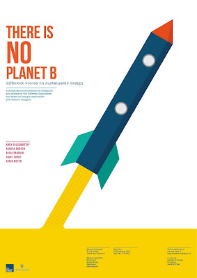
Lee and Donald both agreed that I needed to get rid of the pink lines behind the rocket and actually just make the rocket itself bigger to be able to fill up more white space.
I thought they were right. The pink lines were a bit messy to look at and it clashes a bit with the rocket in a way.
I had to polish my texts at the bottom and make them look smaller. I followed a grid through Indesign.
These were the three final designs that I came up with and it's just a matter of choosing which one is the best.


